Show off your graphics!
Moderators: Bob the Hamster, marionline, SDHawk

-
Meatballsub

- Liquid Metal Slime
- Posts: 996
- Joined: Mon Oct 15, 2007 6:39 pm
- Location: Northwest Georgia
- Contact:
-
Spoonweaver

- Liquid Metal King Slime
- Posts: 6467
- Joined: Mon Dec 08, 2008 7:07 am
- Contact:


-
Spoonweaver
- Liquid Metal King Slime
- Posts: 6467
- Joined: Mon Dec 08, 2008 7:07 am
- Contact:
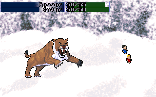
@G-wreck: It's not really that your outline is bad, it's just that your shading is just sooo much better. The Idea of using High Quality pictures as a template is a really good idea. However, you should either do it with ALL the enemies or none at all. As it stands the tiger looks completely out of place in the game.
Oh and as for the eyes, a very simply fix would be to just color them all black and make them a tiny bit smaller. Right now they're a bit comical for a huge killer sabre tooth tiger.
@Master K: Looks neat, though the "Nobody knows...not even me" part make me less impressed.
Oh and as for the eyes, a very simply fix would be to just color them all black and make them a tiny bit smaller. Right now they're a bit comical for a huge killer sabre tooth tiger.
@Master K: Looks neat, though the "Nobody knows...not even me" part make me less impressed.
-
Pepsi Ranger

- Liquid Metal Slime
- Posts: 1457
- Joined: Thu Nov 22, 2007 6:25 am
- Location: South Florida
I think changing the tiger's sclera to something more golden or yellow and less white will make them a little more intimidating. Or, try black sclera and yellow iris. Either way, the crooked nature of the eyes will look less dopey if you get rid of the white. As it stands, it looks like the landscape is eating two holes in its head.
Place Obligatory Signature Here


-
Nathan Karr

- Liquid Metal Slime
- Posts: 1215
- Joined: Fri Jan 25, 2008 3:51 am
- Contact:

@ Spoonweaver - Most of the graphics in the demo were drawn back when my only goal was to make content, regardless of quality. I knew that if I did otherwise, I would spend so much of my time perfecting everything that I would see little progress, and therefore get discouraged.
Now that I have some capital on which to stand, including a morale boost from MSB's review, abandoning this project is no longer an issue. As such, expect to see the artwork given much more care.
@ PR - My palette is saturated, or I would try the yellows like you suggested. I think they would be effective as well. However, since I already had a lot of darks and the unnatural reds from the mouth, I did this: