so the main issue i think you're having is a pretty common one. pixels have a very finite resolution and little details, lots of little details, need to disappear.
More than that, whole ideas need to disappear if they cannot be well represented on the pixel level.
More than that, even in 'serious' styled graphics, EXAGGERATE EXAGGERATE EXAGGERATE.
This is your sprite again, just because im gonna talk a bit about it and i want it to be here for quick reference.

i think i see what you are trying to do on the stomach, an area of tight ripples to replace the abs. or, perhaps, those are abs. it is hard to tell, and its not so much an issue of 'pixelling it wrong' so much as it is 'you cant pixel it right,' (the proverbial 'you,' not you in particular) at least not without more pixels to devote to that spot.
if he is supposed to be large chested and ripped.. well, heres an example
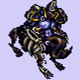
(not to toot my own horn or whatever, and probably not the best example at all, but its right there on my photobucket and i am trying to be fairly quick.)
note how much larger the shoulders are, this alone will stop the feminine appearance on your sprite. granted i had more pixels to work with etc etc. but glueps far shoulder should come out more, and his forward shoulder should come back and up a bit, giving him more of a 'triangle shaped' chest physique. (god the more i write the more i realize this is a terrible example picture for what im trying to say)
whatever.
also note that though there is a light source on this sprite, 'rule of cool' beats it in several areas. well, 'rule of cool' and 'rule of being able to tell what the hell something is'
most things are lit from the upper right, though the chest is lit straight on, and the back leg is brighter than the end of the spine for no good (physical) reason. (...and this is another thing no one ever tells anybody)
using a light source is good, but depicting something so its recognizable is more important. how does this relate back to your picture?
glueps left arm (picture right) is a mess of pixels that dont really say a whole lot.
other unclear places are the top of the head (that one pixel thing doesnt look slimy and i dont get what its supposed to be)
basically, ask yourself: "if i had no idea what this character was supposed to look like, could i fairly clearly tell exactly what EVERY PIXEL represents?" and yes, pixel 'noise,' sometimes works for this (sidewalks, even grass works alright) but unless you are representing a texture, dont just throw pixels down in places because it will make the sprite confusing.
sorry if this is too unorganized to make much sense of.
is it intentional to make him look like he has legs in the new one? Legs covered with a 'dress' of goop, but still legs. if so, thats a nice touch but i feel like the back leg is doing something awkward. if its supposed to be a cylindrical mass of goop (as in your earlier sprites and my sprite) then the transition to shadow should be more gradual.
he looks a lot less angry now, which is good for a hero, haha.
and i dont want you to think that this sprite is in any way bad. i dont think youre doing much wrong, i just think the things you are doing wrong are huge artistic hurdles in pixel art, that take some time to identify and more to rectify and more to have them fully ingrained in you. but getting them identified is the hardest step, because you either need to be told by someone (which rarely happens) or notice it yourself (which possibly never happens)
to hopefully make sense out of this rant:
looks pretty good, certainly improved, anatomy is a little strange on the chest, make the goop bigger, thicker, if for no reason other than if it is bigger, you can render it out as a thing instead of 'pixel noise' that someone has to think about to figure out what it is.
EDIT: of course i dont mind you using those colors. i have (somewhere) a half done palette arranged by color ramps that i keep meaning to finish and release.


