The stuff they don't tell you about making good graphics.

Make games! Discuss those games here.

Moderators: Bob the Hamster, marionline, SDHawk

User avatar
shakeyair
Slime Knight
Posts: 217
Joined: Fri Jun 12, 2009 6:15 am

The stuff they don't tell you about making good graphics.

Post by shakeyair »

So. Maybe you can't pixel well. Maybe you can but this will interest you anyway. I don't know, but I have such a problem with the 'tutorials' out there, yes even the tsugumo one. (which is mostly really good, but for only very specific things)

Because they discuss what works, but not WHY. Well, they sort of discuss why, but its a very literal why, not a very conceptual why. (if that makes sense?...)

This tutorial is NOT end-all be-all. I will write it assuming everyone knows there are cases when I'll say DON'T DO THIS but in a particular situation, it will be the right thing to do. I really mean, DON'T DO THIS UNTIL YOU HAVE ENOUGH PRACTICE TO PULL IT OFF. Or, really, DELETE IT IF YOU TRY IT AND IT DOESN'T WORK. :)

-----------------------------------------------------------------------

So. Lets start from the basics. How long did you spend on your grass tile? Longer than 2 seconds?

Thats a waste of your time.

SECTION 1: THIS IS IMPORTANT: THE GRASS TILE IS NOT IMPORTANT.

This is basically (it might be a different color of green) the only grass tile I will ever use in the OHR:

Image

(at least until the OHR gets a bigger walkabout sprite size)

Whaaaaaat? But its sooooo boring. I know, I know. But look:

Image

Image (from vampiducki's blu eternal, posted elsewhere on the forums. Beautiful, beautiful looking game, and this is even an old screen shot)

And here is my first concept that i don't think anyone explains to people who are just starting out:

You need to draw attention to the important things. This means, the player, and the places the player can go, and to a slightly lesser extent, the stuff you want them looking at for immersion. Grass doesn't have to be a solid color, but it needs to be the background. You don't want people looking at it.

I know-- but-but--Secret of Mana. Yes. The grass was lovely. They could afford to do this because:

1.The sprites were bigger. In the OHR, that style of grass is the size of an average walkabout FIST.
2.For all of its visual complexity, it was very low color. The highlights were not terribly bright either, and the game was very very bright.

--but the kicker:

3.The rest of the game was EVEN MORE BEAUTIFUL. When you played that game, before you started making your own RPGs, you never thought "wow look at that grass!" because, as detailed and awesome as it was, it was still very clearly the least engaging part of the screen to your eyes.

OHR example:

Image 
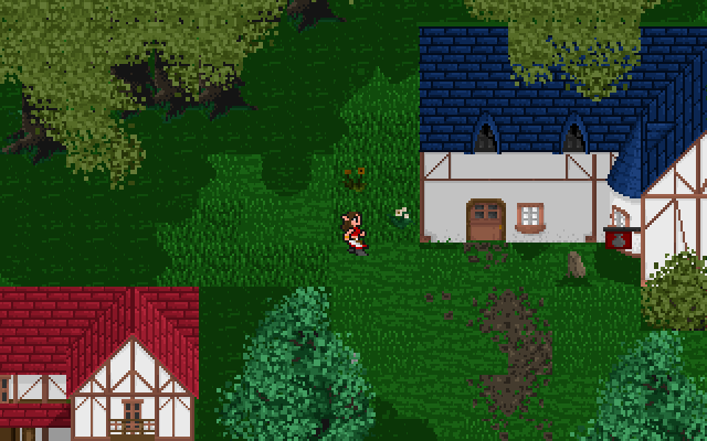
From Lucier's (also very pretty) genesis (also an older screenshot)

The long grass is slightly distracting to me, but I don't have the time to make or find a better example. Its not a point-killer so I'm using this screenshot.

1.The walkabouts have outlines, while nothing on the map does. (this is a great design decision, i think, but i do tend to enjoy outlines on my tiles in my own games)
2.The houses are primarily solid colors, in contrast to the grass

This serves to make the hero and the places she can go stand out more immediately. This is most important. And...

3.The trees are beautiful so no one is examining the grass and thinking "man, those blades of grass are flipping HUGE!"

Ok. So this seems like a long time spent on grass mostly to convince you to just use a solid green square, but look at what happens when a player doesn't stand out enough from the background:

Image (Sorry Mogri. It was a fun game even though I sucked at it, but it had this problem a lot)

If that doesn't make it clear, I am not just talking about the grass tile. I'm talking about any tile which has nearly no significance. ESPECIALLY a tile which has nearly no significance but is used far more often than any other tile.

This brings me to my next point.

SECTION 2: DON'T JUST FILL THE SCREEN WITH A GROUND TILE

I know, I know: "Shakey, you haven't taught me ANYTHING about pixelling yet!" Trust me. I am getting you to the mindset you need to be in to start doing things right. First lets look back at Blu Eternal:

Image

The right side of this picture is far, far superior to the left. Yes, this is mostly because those trees are awesome, but its also just because it has STUFF and it feels much more like a real place.

Yes, there are real places that are vast expanses of grass or brick. Why would you want to make someone walk at a movement speed of 4 through that? Maybe a better title, actually, for this section is...

SECTION 2:MAKE YOUR SETTINGS VISUALLY INTERESTING

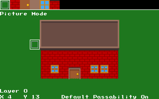
Let me show you some bull i just threw together. Here's take 1:

Image

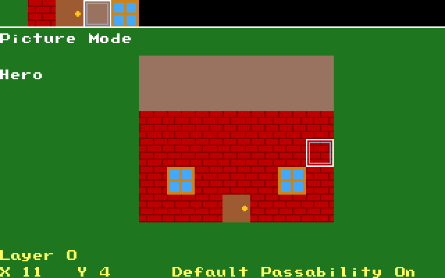
This is gameplay minimum. Boring, but passable, enough to identify what everything is. But just a minute of thinking about a city building (chich is inexplicably in grass right now?) and i think:

"Wait. The roofs aren't totally flat, they have raised borders. Wait. Doors have frames. Wait. Windows come out from the wall. Wait. Symmetry is boring..."

Image

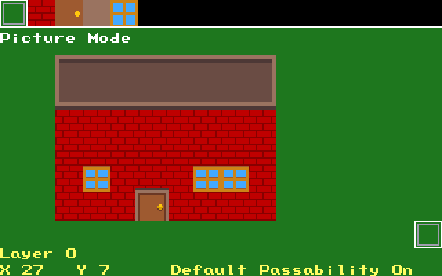
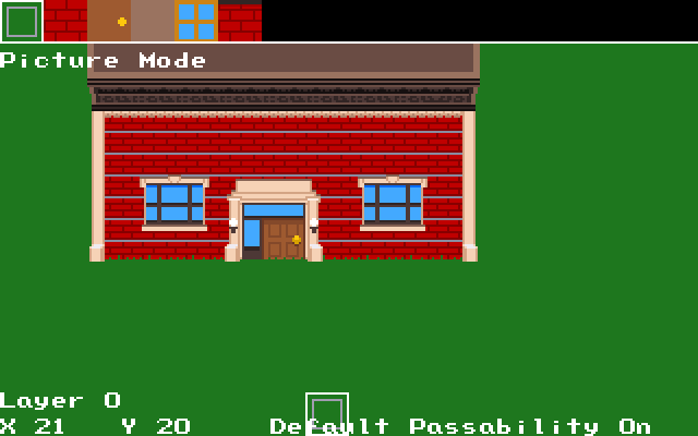
This is about 1000x better, using really no artistic ability, no interesting ideas. Just common sense. Lets take it a step further...

Wait actually we won't because I'm out of time. Shame, too, because we need to take this about 3 more steps before the point of this section becomes clear. Tomorrow.

And yes, it will be a few more sections before I get to actually telling you how to make things look good. The problem is, you need to know WHY things 'look good.' And most people who are good at drawing/pixelling let people figure out the "common sense" stuff themselves, totally forgetting that it isn't even kind of common sense to someone who doesn't have that artistic sort of background.
User avatar
msw188
Metal Slime
Posts: 787
Joined: Tue Oct 16, 2007 1:43 am
Location: Los Angeles, CA

Post by msw188 »

I believe this should be a Hamsterspeak article (or series of articles).
I am Srime
User avatar
Voltire
Slime Knight
Posts: 285
Joined: Thu Nov 25, 2010 3:48 am
Location: Santa Barbara, CA

Post by Voltire »

This is going somewhere. And I agree with msw. Send it to Surlaw?
User avatar
Baconlabs
Liquid Metal Slime
Posts: 1067
Joined: Mon Nov 02, 2009 6:29 am
Location: Middlin, TN

Post by Baconlabs »

[s]Seconded[/s] Thirded
Also hooray for using Mother 3 as an example of style
User avatar
Mogri
Super Slime
Posts: 4669
Joined: Mon Oct 15, 2007 6:38 pm
Location: Austin, TX
Contact:

Post by Mogri »

Fantastic article.

Timpoline is an excellent example of poor hero-to-background contrast. Fortunately(?), there's not a ton going on in the game, so it's never as bad a problem as it could be, but I'm not sure how I would've addressed it without changing the game's visual aesthetic.

In my defense, at least the SMB and Metroid levels had black backgrounds :v:
User avatar
shakeyair
Slime Knight
Posts: 217
Joined: Fri Jun 12, 2009 6:15 am

Post by shakeyair »

Hey, turns out my conflicting thing fell through!

I would be happy to put it in Hamster Speak, for posterity more than anything, but I feel like the discussion is possibly more important than what I have to say. And I'd like the opportunity to make edits to parts things people maybe didn't get or aren't illustrated as clearly as they could be.

Also, I felt okay using other OHR members graphics because they are already on the board. If I submit it to Hamster Speak I'm gonna need to get their expressed permission, I think. (I think I would also want to do this to crosspost on Castle Paradox)

(also, if someone wants me to not use their screenshots, please let me know and I will remove it right away of course!)

I'm gonna work out hopefully the rest of section 2 and edit it right in here in a bit.
User avatar
The Wobbler
A Scrambled Egg
Posts: 2817
Joined: Mon Oct 15, 2007 8:36 pm
Location: Underwater
Contact:

Post by The Wobbler »

You never need permission to post screenshots from any game, professional or indie, unless there's a non-disclosure agreement.
User avatar
Sh4d0ws
Slime Knight
Posts: 199
Joined: Sun May 02, 2010 6:32 pm

Post by Sh4d0ws »

Just I thought I'd tell you I really like where this is going. I especially love that you use professional examples in conjunctions with OHR ones. :)
User avatar
Newbie Newtype
Reigning Smash Champion
Posts: 1873
Joined: Mon Oct 15, 2007 9:44 pm

Post by Newbie Newtype »

I interpreted this topic as "Tsugumo's tutorial sucks".
<TheGiz> oh hai doggy, oh no that's the straw that broke tjhe came baclsb
User avatar
Pepsi Ranger
Liquid Metal Slime
Posts: 1457
Joined: Thu Nov 22, 2007 6:25 am
Location: South Florida

Post by Pepsi Ranger »

Best article on graphics I've read in a long time. Even better than Djfenix's article about base sizes for buildings (http://superwalrusland.com/ohr/issue27/arch/arch.html).

I like the idea of turning this into a discussion, but I would also suggest that if some good comments come out of this discussion that you compile them into a separate entry for the tutorial series on HamsterSpeak, so that nonforum readers can still get the benefit of reading about them.
Place Obligatory Signature Here
User avatar
FnrrfYgmSchnish
Metal Slime
Posts: 741
Joined: Thu Jun 18, 2009 4:37 am
Location: Middle of Nowhere

Post by FnrrfYgmSchnish »

Now that I think of it, I've never actually done a "flat green for grass" grass tile in any of my games. Of course, I haven't gotten around to even starting on grass tiles for Fnrrf Ygm Schnish: Alleghany Hell school yet, so I might try that out.

But yeah, "grass/floor/etc. tiles shouldn't stand out more than the stuff that's on top of them" is definitely something that people need to watch out for.
I've generally gone with the "floors/ground doesn't have outlines, but walkabouts and sometimes higher-up objects do" method in my games... well, at least the recent ones (some of my old ones had areas where the walkabouts blend in with the backgrounds pretty bad, since most walkabouts didn't have outlines and some of them had white skin... so if you walk around in snow sometimes it's hard to tell there's anything more than a face hovering around.)

I'm guessing the next step with that brick house will involve either shading on the far left/right edges of the walls, or more detail in the bricks themselves (like cracks and texture-marks.) Or maybe both?
I interpreted this topic as "Tsugumo's tutorial sucks".
That's an odd interpretation, considering that it's only mentioned once and is described as "(mostly) really good"...
Last edited by FnrrfYgmSchnish on Mon Mar 21, 2022 3:16 am, edited 1 time in total.
FYS:AHS -- Working on Yagziknian NPC walkabout sprites
User avatar
shakeyair
Slime Knight
Posts: 217
Joined: Fri Jun 12, 2009 6:15 am

Post by shakeyair »

Newbie Newtype wrote:I interpreted this topic as "Tsugumo's tutorial sucks".
No no no. I don't think that at all. Tsugumo's tutorial is likely the best generic pixel tutorial I've seen. He even has a section which talks about the exact same thing as my first section. My issue with it, is there's too much "do this" and not enough explanation to really help people think about how to handle things in other situations besides the one he is currently talking about. I know, he says 'a green tile is a bad way to do grass' but I think that is the only thing I flat out disagree with him on. (And much of that disagreement comes from the OHRRPGCE's fairly small walkabout sprite size.)

Basically, as much as it may seem like it now, I am NOT competing with any of the tutorials out there. They are all worth reading. I have read them, and I have learned a lot from them. This should become clear as I go further that I am making an effort to fill in the gaps of information that I think people with little to no artistic background just don't have. Also, this is going to be extremely OHR-centric, which will help newcomers more I think.

(Also, before I continue i would like to say that I'm very very aware the colors on the tutorial building look bad. This is intentional as it will give us a good jumping point to talk about palettes and moods later)

-------------------------------------------------------------------------------------------------

So. We currently have a house, which I've updated just slightly more:

Image

So the thoughts behind this one are:

The building was too high for the inside to be single story. It was not deep enough to believably enter. (QUICK TIP: The roof of a flat topped building is the same size as the unseen floor. Remember this when making wall maps!)

EDIT: See Pepsi's link above for this quick tip in a much expanded form!

Often the borders of the roof come out from the building.
The windows are too high compared to the NPC size, and probably shouldn't be the same size as a door. (yes these take up 2 tiles now, but conserving tiles is no longer something to be too concerned with)
The grass got some little defined blades which come up over the edge of the building.


This is, while not the best thing ever, pretty acceptable. This is the point when I would say "these graphics don't distract me at all from this game experience." For a simple world not terribly concerned with immersion, even the last step would have probably been fine.

But what sort of tutorial teaches you how to get to 'pretty acceptable' and ends it there? Now's when things get interesting.

Shading? Nope.
Cracked Brick? Nope.
An environment? Nope. (keep in mind this section is JUST about the building. An environment would definitely help a lot.)

So then what?

Google image search "brick building" and I guarantee you wont find a single real building in existence that looks anything like our little tutorial building. I would venture to say that more than half of making something look good is in the design, and not the execution.

Lets look at Earthbound.

Image

Earthbound is the penultimate example of our next step. Why? Right here in the tutorial we are going from 'passable' to 'good,' and 'good' is right where Earthbound sits. Lets look at the doorways.

First off, they break perspective but look ok. We will talk about why this is in the next section.

But more than that Earthbound gave some thought to "What kind of doorway should this building have?" instead of slapping a door and a lame border on it and calling it good. More than that, "what could this building look like?" The police station is a good example, it has an interestingly designed 'frame' (let me know if theres a better word?) supporting its roof. The pizza building has glass doors and an awning.

So. What sort of building is our random building in the middle of a big grassy field? Lets keep it generic for now, to show better the point when "this is a good amount of detail." Here's where we look at pictures of some brick buildings.

Image

This one is cool. Lets 'skin' our building with this building:

Image

A very important thing changed during this step. This generic building went from being a SYMBOL of a generic building to something which resembles an ACTUAL generic building.

Notice that I outright stole the features that grabbed me the most from that photograph, but kept it pretty simple. (the roof is cut out as it has not been changed yet) If I felt like it, I could go all out and use every feature of the building, from the fire stairs to the auxiliary doors on the left and right.

I also opted to keep the door very generic, because it is the place the player can go. (This is one reason why I'm a fan of black, open doorways) This is more about personal taste than anything else, though, it would still be pretty recognizable as a door if it were more accurate to the source picture.

Some sort of artistically challenging (at a simple level) things happen at the edge of the house and the doorway. We cheat perspective to drive home the point that these little things are butting out. Just like Earthbound. Again, this will be touched on more in the next section.

But besides that, the presentation is still very simple. There is still no shading. Theres sort of a texture in the 'roof frame' but its just noisy gobbledygook with no real significance.

QUICK EDIT: Also I want you to notice how much less it matters how the bricks look once the windows and doorframe and roof frame (?) are given more significance and character. The white line going through the bricks every 3 rows is inconsequential, and the more i look at it the more I think maybe it shouldn't even be there.

I gotta go now but I'll continue some more on this later, we're still gonna take this building a bit further, but I think theres a lot more to talk about that this edit opens up and I'd like to get to all of that first.

For me, not you (yet):

Repeated patterns. Character. Tile Layers. Scale.
Section 3: Playing with perspective.
Last edited by shakeyair on Sun Apr 10, 2011 9:14 pm, edited 4 times in total.
User avatar
msw188
Metal Slime
Posts: 787
Joined: Tue Oct 16, 2007 1:43 am
Location: Los Angeles, CA

Post by msw188 »

Just commenting that I agree on getting rid of the horizontal white lines.

As a matter of taste, I'm not a big fan of the doorway looking so huge now. In fact, usually the place where I end up disagreeing with others on graphics is precisely this - the enlarging of 'significant' details (the old 2pixel eyes and large face versus body is the main offender). Sometimes I feel I'm the only one who feels this way though.

If that paragraph isn't clear, consider: the 'real' doorframe is about twice as tall as it is wide, and yet the OHR doorframe looks square. Contrast this with the screenshot from Genesis, with doors that are probably nearly square when counted pixel by pixel, but don't look at all square to me in the screenshot. I have no clue how - I see the 'top' windows are less pixels than the bottom ones, and I wonder if this has managed to cheat my eyes somehow.
I am Srime
User avatar
Pepsi Ranger
Liquid Metal Slime
Posts: 1457
Joined: Thu Nov 22, 2007 6:25 am
Location: South Florida

Post by Pepsi Ranger »

This is the type of thread that will be beneficial to new users five years from now, and should therefore be stickied, or moved into a special "Articles" category.
Place Obligatory Signature Here
User avatar
Nathan Karr
Liquid Metal Slime
Posts: 1215
Joined: Fri Jan 25, 2008 3:51 am
Contact:

Post by Nathan Karr »

I like the grass tile from Seiken Densetsu, and have copied it endlessly since reading a tutorial that said it was good (and disagreeing with those it said looked better). Still, as you're showing, the blank green can work.
Remeber: God made you special and he loves you very much. Bye!
Post Reply