Hype Up Your Game Thread
Moderators: Bob the Hamster, marionline, SDHawk
- Pepsi Ranger
- Liquid Metal Slime
- Posts: 1457
- Joined: Thu Nov 22, 2007 6:25 am
- Location: South Florida
Fnnrf:
So glad you're past your mapping barrier that held you back from making that game for so long. Looks nice, certainly, but here's to hoping that it plays nice, too (but not too nice).
Nathan:
I don't care which enemies you get rid of, as long as you keep the Underground Monkey. Put a good backstory behind it and I think you'll have designed an instant classic.
I say this with the optimism that the rest of the OHR community thinks the idea of an underground monkey is almost genius. You've got a tall ladder to climb if they're not.
Place Obligatory Signature Here
- Spazman
- Slime Knight
- Posts: 253
- Joined: Sun Jul 17, 2011 1:46 am
- Location: Online, somewhere.
- Contact:
Here are a few bits and pieces of what's going into the next few parts of Doom RPG: Evil Unleashed.
A rather scary area, which I hope serves well to be part of a boss area:

A close up of one of the parts of the map:

And, the maptile set so far:

i'm getting off to a wonderful start to the full version of the game. Be watching and waiting.
A rather scary area, which I hope serves well to be part of a boss area:

A close up of one of the parts of the map:

And, the maptile set so far:

i'm getting off to a wonderful start to the full version of the game. Be watching and waiting.
- Soda_piggy
- Slime Knight
- Posts: 163
- Joined: Tue Oct 16, 2007 1:18 am
- Location: Osaka, Japan
- Contact:
New Blu Eternal Pic
Finally had some free time from work. It's been a long time since I had free time.  Anyway, after many long hours of experimentation and STUPID math, I finished making a custom palette for Blu Eternal that can more smoothly blend across the color spectrum, allowing a much more fluid-looking form of pixel art. I've come to believe that lighting and mood are extremely important for indie games now, more than ever before.
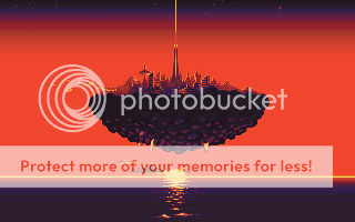
I just started working on this piece today (so it's not finished yet). It's for Blu Eternal's title screen. I only used a limited palette of 17 colors (from Blu Eternal's full 256 color palette) for this screen. The palette begins at a deep purple and blends all the way up to a light yellow.
First, the screen's palette:

And now, the screen itself:

I hope you all enjoy! Let me know what you think.
Comments and questions are all welcomed! Thanks!
I just started working on this piece today (so it's not finished yet). It's for Blu Eternal's title screen. I only used a limited palette of 17 colors (from Blu Eternal's full 256 color palette) for this screen. The palette begins at a deep purple and blends all the way up to a light yellow.
First, the screen's palette:

And now, the screen itself:

I hope you all enjoy! Let me know what you think.
Comments and questions are all welcomed! Thanks!
<a href="https://www.sodapiggymusic.com">Soda Piggy Website</a>
- Meatballsub
- Liquid Metal Slime
- Posts: 996
- Joined: Mon Oct 15, 2007 6:39 pm
- Location: Northwest Georgia
- Contact:
- Bob the Hamster
- Lord of the Slimes
- Posts: 7660
- Joined: Tue Oct 16, 2007 2:34 pm
- Location: Hamster Republic (Ontario Enclave)
- Contact:
Re: New Blu Eternal Pic
Beautiful work!VampiDucki wrote: I just started working on this piece today (so it's not finished yet). It's for Blu Eternal's title screen. I only used a limited palette of 17 colors (from Blu Eternal's full 256 color palette) for this screen. The palette begins at a deep purple and blends all the way up to a light yellow.
Would you be willing to share your palette for others to try and use?
- Spoonweaver
- Liquid Metal King Slime
- Posts: 6466
- Joined: Mon Dec 08, 2008 7:07 am
- Contact:
That's really insane haha. Just out of curiosity do most of you guys end up drawing the pictures somewhere else and then importing them? I feel like I hear that a lot of people do that. I've never tried it and I was wondering if it's really worth it- especially if I'm not really all that concerned with crazy quality.
You can't fix stupidity.
- Soda_piggy
- Slime Knight
- Posts: 163
- Joined: Tue Oct 16, 2007 1:18 am
- Location: Osaka, Japan
- Contact:
Sure, James! If anyone wants to try out the palette, you are more than welcome. I was hoping other people in the community could make good use of it too.
Also, I'm going to include an explanation of how it works below. It's built in a weird way to optimize color use and blending, so I really feel it needs clarification.
Here is the palette itself:


Ok! Next, let me give a short explanation about how this palette works...
In the top-left corner you have true black.. After true black, there are 5 shades of deep purple. These are the darkest colors in the palette. All of the other colors in the palette are ramped-up from the lightest shade of deep purple. This means every color has a common shadow color.
After the five deep purple colors, you will see the lightest two shades of green, blue, red and yellow, in that order (then one shade of light gray). These are so you can finish each ramp from the deepest purple all the way up to true white. Any reddish-looking color can be finished off with the highest two reds. Same goes for blues, greens, etc.
Because of the way I ramped the colors, you can move fairly smoothly across the entire spectrum (from the top yellow-green to the bottommost yellow) and blend every color, which really opens up the possibilities for mood in an image. Hopefully this should liberate things a bit for any aspiring pixel artists out there.
This type of color-ramping also gives you a total of 25 tints to each color (this is if you start at true black, ramp through the deep purples, and all the way up to true white after using two cap colors from the top row).
Here's an example so you can see what I mean:

The only two colors NOT in line with the main spectrum are the gray and skin tones. This is because these two are a little awkward and don't line up well with the rest of them. Because of this, they are at the very bottom. To avoid confusion, I put the gray first to make it a little more clear where the spectrum ends.
So, from the top, the spectrum begins at a yellow-green and ends at the bottom on yellow.
Sorry for the lengthy explanation, but I felt it was necessary to really use the palette to the fullest. I hope that helps to clear things up.
Also, I'm going to include an explanation of how it works below. It's built in a weird way to optimize color use and blending, so I really feel it needs clarification.
Here is the palette itself:


Ok! Next, let me give a short explanation about how this palette works...
In the top-left corner you have true black.. After true black, there are 5 shades of deep purple. These are the darkest colors in the palette. All of the other colors in the palette are ramped-up from the lightest shade of deep purple. This means every color has a common shadow color.
After the five deep purple colors, you will see the lightest two shades of green, blue, red and yellow, in that order (then one shade of light gray). These are so you can finish each ramp from the deepest purple all the way up to true white. Any reddish-looking color can be finished off with the highest two reds. Same goes for blues, greens, etc.
Because of the way I ramped the colors, you can move fairly smoothly across the entire spectrum (from the top yellow-green to the bottommost yellow) and blend every color, which really opens up the possibilities for mood in an image. Hopefully this should liberate things a bit for any aspiring pixel artists out there.
This type of color-ramping also gives you a total of 25 tints to each color (this is if you start at true black, ramp through the deep purples, and all the way up to true white after using two cap colors from the top row).
Here's an example so you can see what I mean:

The only two colors NOT in line with the main spectrum are the gray and skin tones. This is because these two are a little awkward and don't line up well with the rest of them. Because of this, they are at the very bottom. To avoid confusion, I put the gray first to make it a little more clear where the spectrum ends.
So, from the top, the spectrum begins at a yellow-green and ends at the bottom on yellow.
Sorry for the lengthy explanation, but I felt it was necessary to really use the palette to the fullest. I hope that helps to clear things up.
<a href="https://www.sodapiggymusic.com">Soda Piggy Website</a>
that is very nice, and looks like a lot of fun to use. i might try it out sometime, if only to flex my pixel muscles.
purple is by far the best shadow color. its so rich, even that dark. does sharing so many shadow colors have any negative effect on portraying certain materials or moods?
i am just curious because i have been working on a palette arranged by multiple ramps, of many colors, with specific materials in mind. i have also played with sharing a dark purple, and find when i test it there are times where i want say, a very dark green or whatever. but any palette will have its drawbacks, so i guess im just wondering if its ever gotten in your way?
also, because i am clearly a nerd.
- Soda_piggy
- Slime Knight
- Posts: 163
- Joined: Tue Oct 16, 2007 1:18 am
- Location: Osaka, Japan
- Contact:
I'm sure there will be some cases where this specific palette won't work well, but I'm still experimenting with it and tweaking. As for right now, however, it's great for natural-looking lighting, and anything in nature really. I'm going to try it out with darker things later and metals, etc.
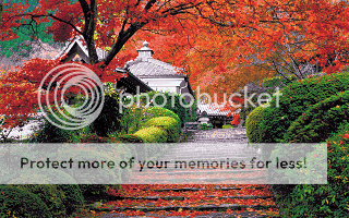
I tried it with directly importing photos into custom too. Here's a pic. The first is the original image and the second is how custom took it with the palette I made. It lost a little vibrance, and it's darker in one or two places, but overall, it's not bad.
Pre-OHR:

In OHR:

I tried it with directly importing photos into custom too. Here's a pic. The first is the original image and the second is how custom took it with the palette I made. It lost a little vibrance, and it's darker in one or two places, but overall, it's not bad.
Pre-OHR:

In OHR:

<a href="https://www.sodapiggymusic.com">Soda Piggy Website</a>
- Spoonweaver
- Liquid Metal King Slime
- Posts: 6466
- Joined: Mon Dec 08, 2008 7:07 am
- Contact:
Your palette is genius, Vampi! Will give it a go. I'll likely end up changing the bottom row into darker grays as they're pretty handy for certain background contrast, though completely unnecessary. Looks like you covered all those colors pretty well, and I tend not to need much in the way of skin tones.
ncw64: It is definitely worth importing, at least give it a test. Especially with layering.
shakeyair: there shouldn't be any negative effect, unless you don't want your game to look too colorful. One of the best ways to control mood is by contrast, ie using 'hot' vs 'cold' colors, like in Vampi's screenshot. Notice how red (hot) pushes out purple (cold). Basis for old-school 3D!
Last edited by charbile on Tue Sep 13, 2011 10:37 pm, edited 1 time in total.


